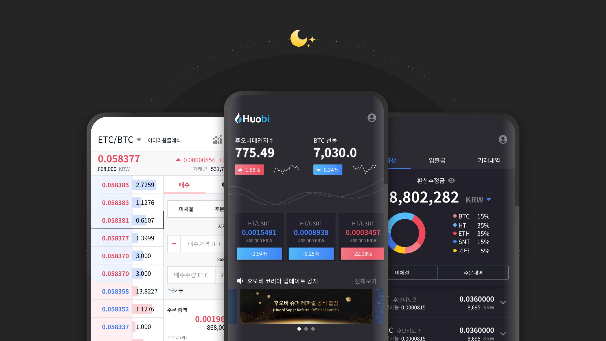
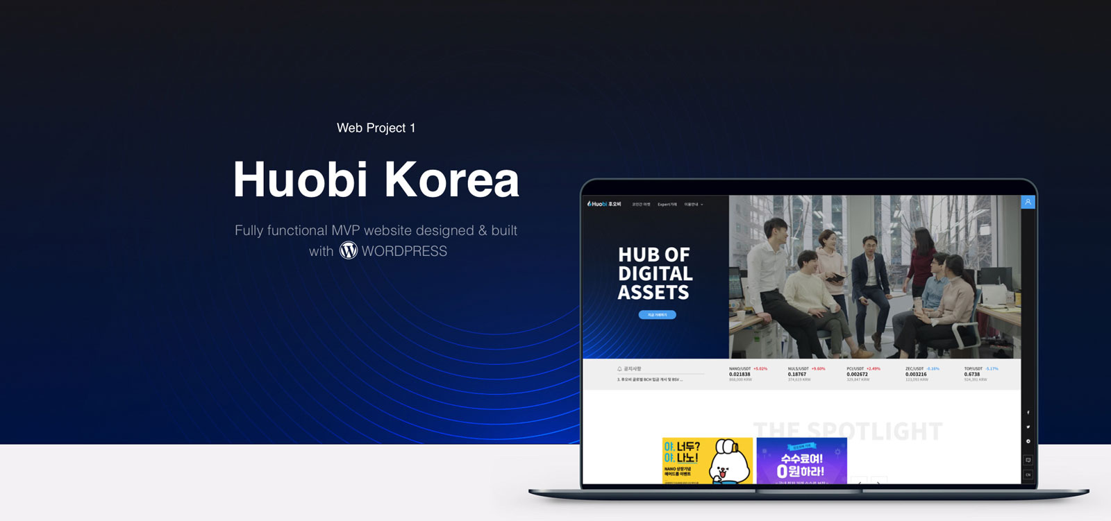
HUOBI KOREA WEB & APP
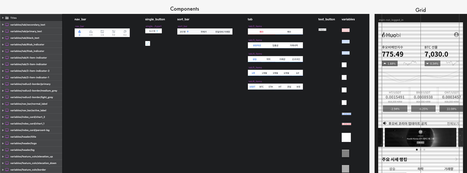
Things I tried to improve with the redesign
1.Better brand impression
In the cryptocurrency industry, Huobi is a big name back in its home country China. However, a lot of Korean users are not familiar with this brand. The old homepage failed to introduce the brand well in this regard.
2.Better conversion rate
The old homepage does not use space effectively. Some sections have taken way more space than needed. Plus, buttons like “CTA” and “MORE” are absent, which should be responsible for a low conversion rate for whatever purpose the homepage is supposed to serve.
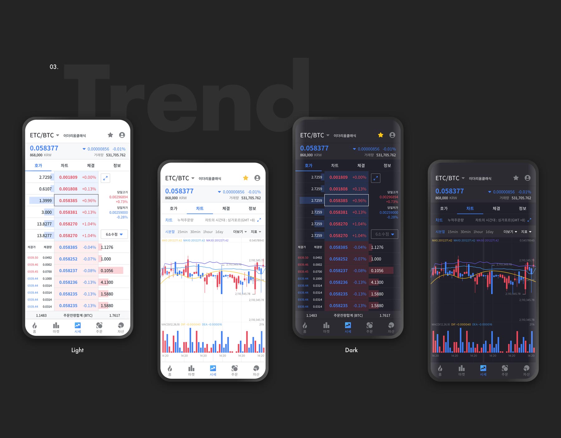
3.Better responsiveness
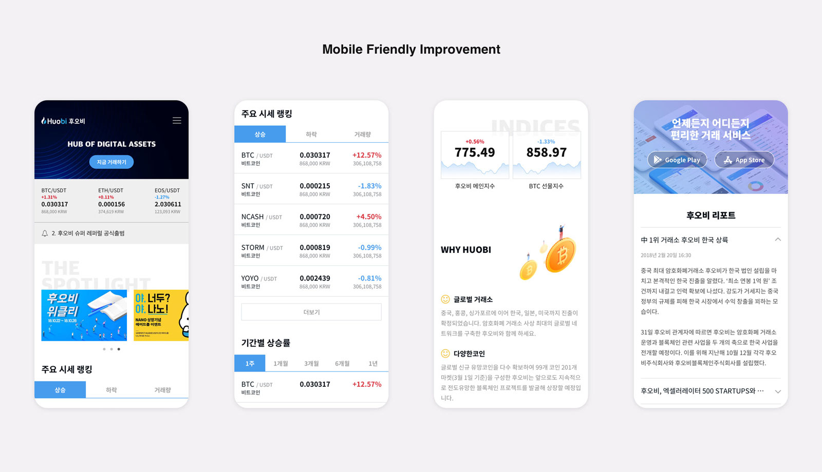
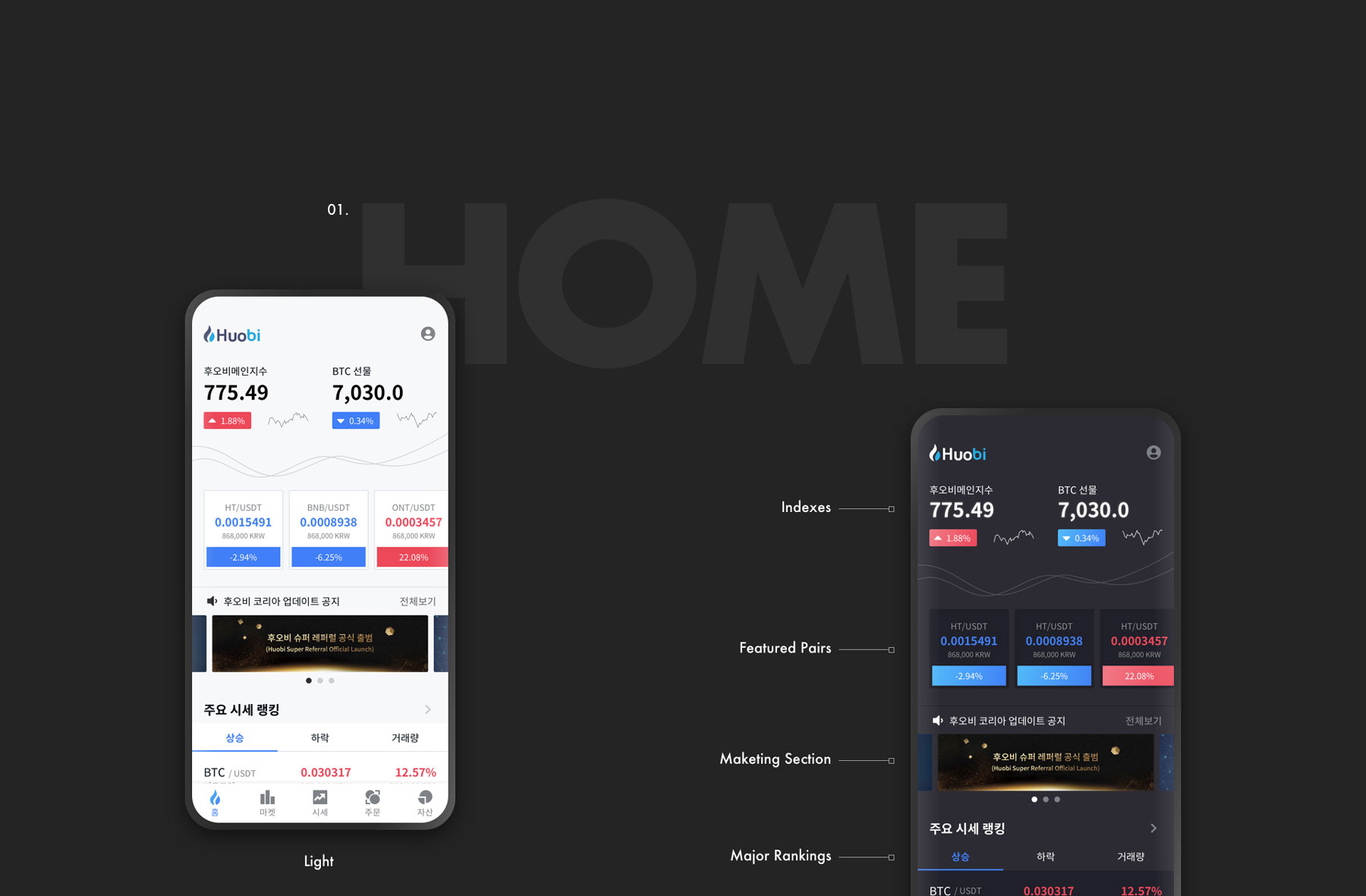
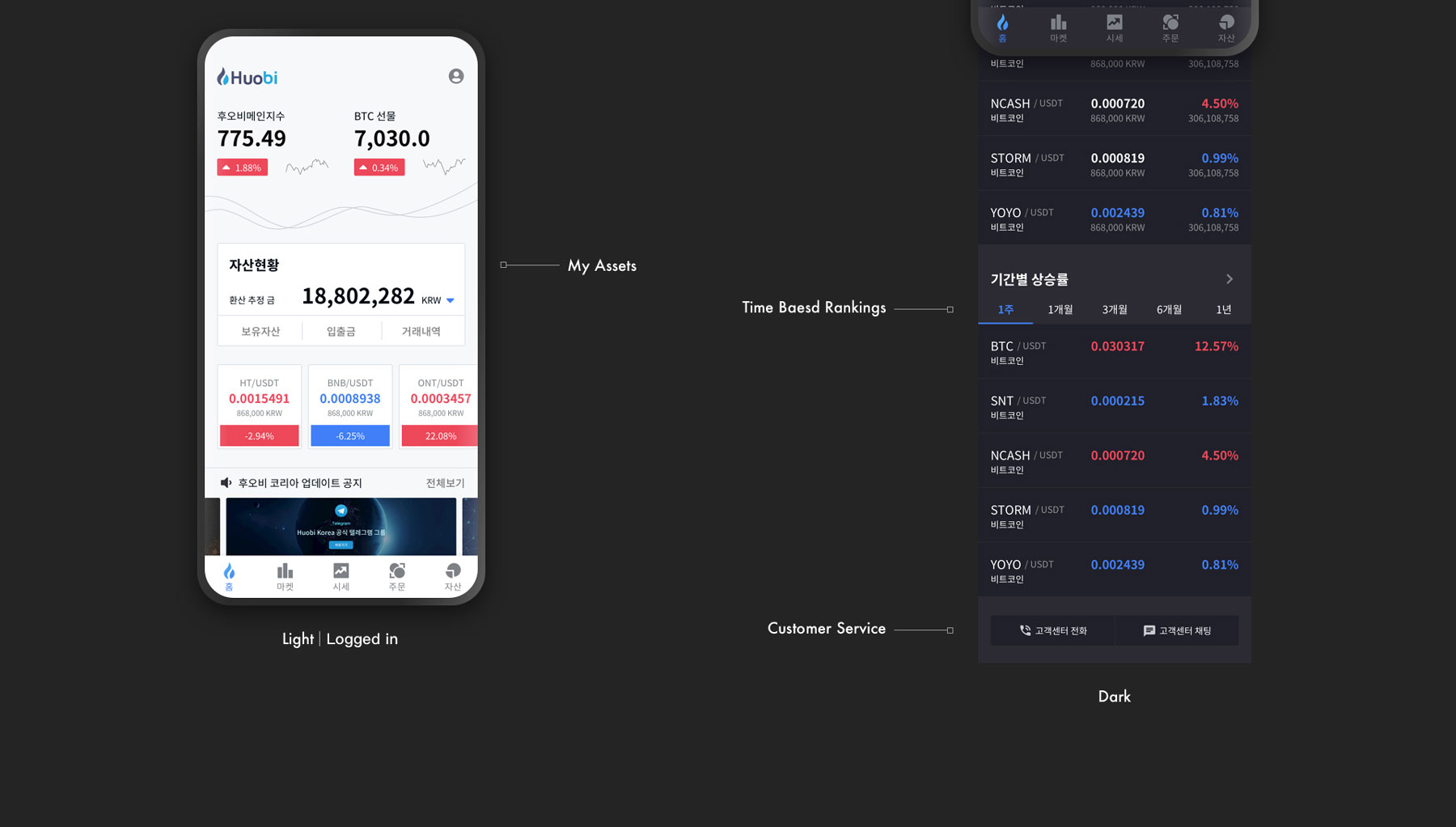
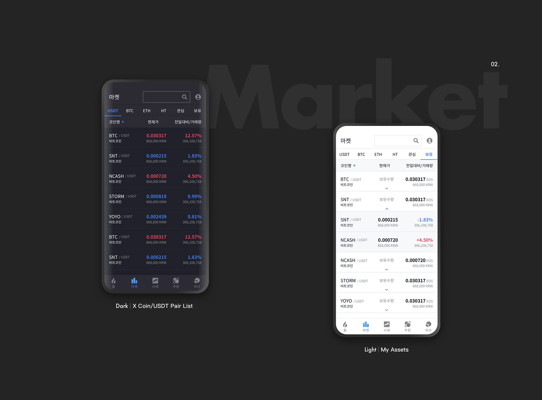
Backend statistics cannot show more clearly that so many visitors browse the page with their mobile devices. However, the old homepage failed to provide a consistent mobile experience. I mean, it’s already 2018.
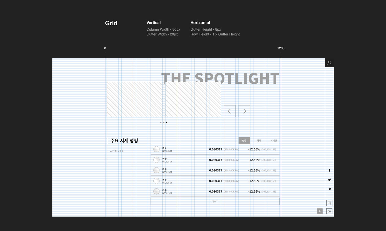
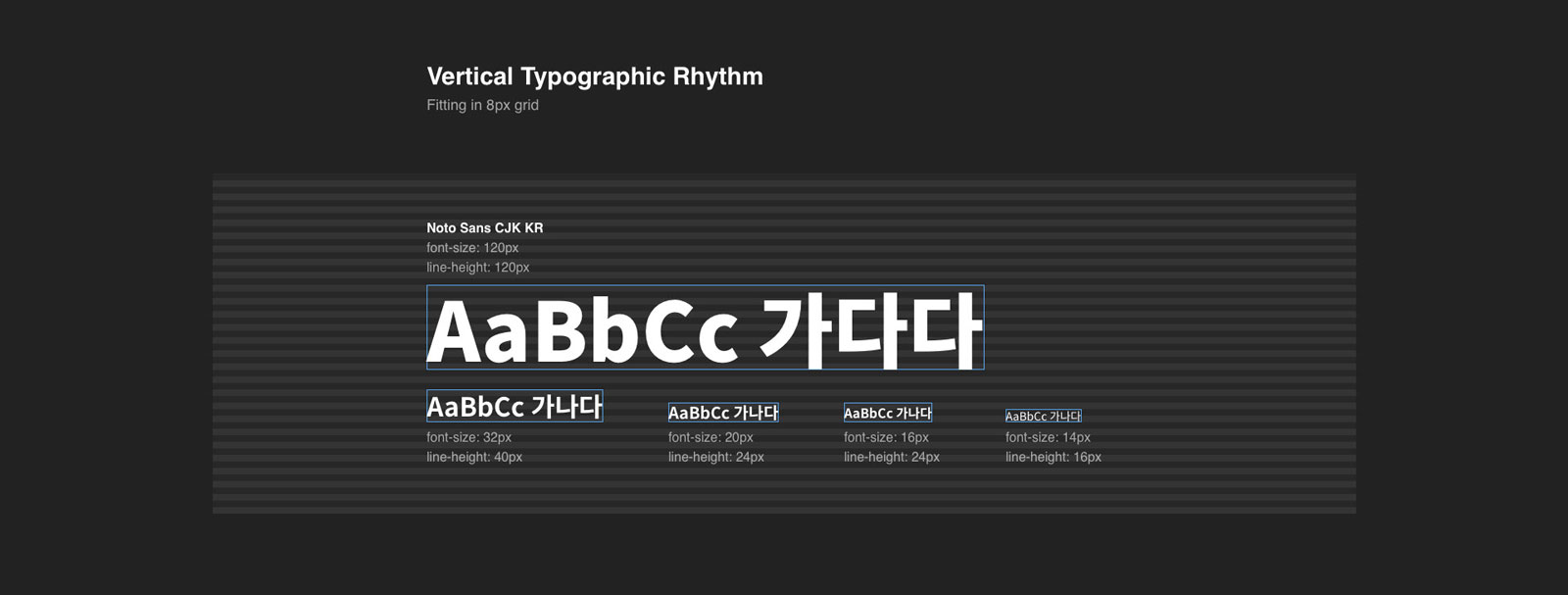
My main objective in this section is to maximize space utilization, persuading visitors to stay, scroll or take actions. So,
1. I placed the corporate video on top of the page because it is helpful in both visually appealing visitors and portraiting the company’s image.
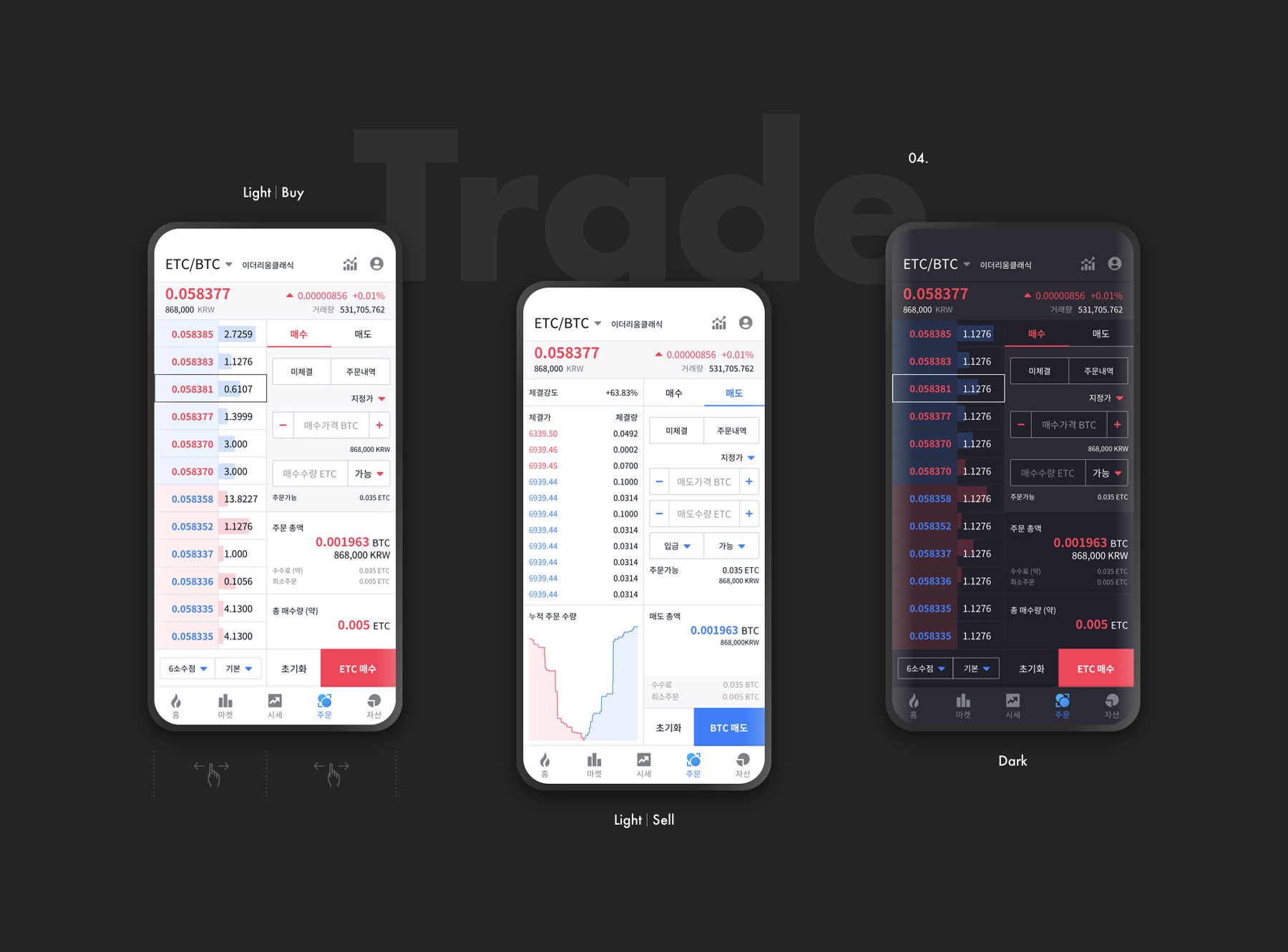
2. The CTA button that leads visitors to the exchange page goes where it is often expected to be.
3. Notifications and trending coin pairs are displayed repeatedly when the page is initially loaded.
4. Banners are still on the first screen. Instead, I changed the banner size to a more maintainable size compared to the one on the existing homepage.
Re-organized tables with clear “More” button leading visitors to the exchange page.
Changes in this section include:
1. Redesigning the “Download App” area. I applied the parallax scroll effect with a background image showcasing several key pages of the app.
2. Replacing the cold tone illustration with a warm one to balance the tone of the entire homepage. Plus, I added a slight floating animation to the new illustration to bring the page to life.
3. Adding Two new content sections – indices and reports.